


Dreaming in Hi-Def

An overlooked, yet critical job of the design team is carefully curating colors that will be in upcoming lines. What may seem like a whimsical decision of “oh that looks nice”, is a time-sensitive and strategic process. With a variety of colors to choose from, the process includes everything from initial attraction to emotional portrayals. So, here is the design team ready to dive into their process for selecting and pairing colors.

HANNAH: FOR STARTERS, THERE ARE SO MANY AMAZING COLOR OPTIONS IN THIS WORLD, HOW DO YOU EVEN BEGIN TO CHOOSE COLORS FOR A LINE?
SALLY: Abundance of choice is both a blessing and a curse. Sometimes people just want help with choice - and we see ourselves as helpful color choosers. We start with a visceral attraction. This might get kinda woo woo, but color is emotional. We feel them.
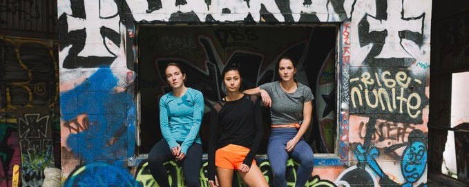
NELLE: The theme for Spring 17 is Destroy//Create, so we have colors that are dark and dangerous (black, charcoal, curfew or dark blue) paired with colors that show life, growth, vitality, optimism (Snap, Plum, Coast, Tide, White).
KAMI: Yes! And after the breaking down of the destruction - we have a yearning to create, to make, to show how life and love can rise.


H: WHAT WAS THE INSPIRATION BEHIND THE COLOR CHOICES FOR THE SPRING 17 LINE?
S: Darkness precedes light. Light precedes growth. Universal truths like this have a meaning, and can also be represented by color.
N: Color is also a metaphor for diversity. We want to fully embrace a diverse and lively world.
K: Color can also be messy. It's okay to be messy.

H: IT'S NO SECRET - WE LOVE TELLING STORIES THROUGH DESIGN. HOW DO COLORS PLAY A PART IN HELPING THE DESIGN TEAM BUILD A STORY?
S: Color is one of the lead actors in a seasonal play. A production that involves the set (the silhouettes), the props (the trims), and the lighting (color). Each has its purpose. And they're all intertwined.
N: The story that a color like Snap tells is much different than a color like Plum. Snap is both happy and brazen. She fears nothing, but isn't afraid to laugh or be playful. Plum is sophisticated but still runs to the beat of her own drummer.
K: Then there's Slate - that can play nice, like a grey neutral, but flirts with warmth and a lavender undertone.
S: Then, start combining the above, and it's like an energetic party, where the just-right mix of people transcend the single story.

H: IT CAN BE INTIMIDATING PAIRING TWO BOLD COLORS... HOW DO YOU CHOOSE WHAT COLORS TO PAIR?
S: The first rule of thumb is there is no rule of thumb. Dress how you like. The way that makes you happy! The second rule is balance. Lights and darks are the easiest example.
N: Balance can also be achieved through contrasts (opposite ends of the color wheel) or complements (same side of the wheel). And then there's prints. A floral pattern plus a fierce background of black is what makes Floral Spandos so awesome.
K: In addition to color, pairing texture and pattern is also amazing and fun. Snap with White Paintbrush Print, or Slate with Snap Flyout Tops. And even patterns together can be brilliant. A tip for reducing the chaos is to pair a refined pattern (like Paintbrush) with something big and bold (like Space Grid or the Sticks print).

H: OUT OF ALL THE SPRING 17 COLORS, WHAT'S YOUR FAVORITE UNEXPECTED COLOR COMBO?
S: I'm obsessed with the Two Timing Tank in the Paintbrush prints. Both black and white.
N: Slate with literally anything!
K: My favorite color of the line was Snap and pairing it with darker colors such as Midnight or Slate when needing to balance out some of the "bright".
Primary Subcategory
Style - Brand
MORE STORIES

Core Routine For Runners: The Dozen
I was introduced to the "The Dozen" in the winter of 2012 by my favorite Oregon running family. I love this set of core exercises for its efficient targeting of core muscle groups, and because no gym equipment is required! You can do this on a grass field, in your hotel room, or really anywhere you can lay on a flat surface.

Reflecting on the Year of the Underbird
This past August, we launched our Year of the Underbird program: an open application for aspiring Olympic Trials marathoners, with a promise to select 5 women for a 6 month contract encompassing a stipend, gear, storytelling, and community support. As we reach the end of our flight with our selected athletes, we invited each of them to share a few reflections on their past 6 months as teammates.

Black History Month: Celebrating Our Athletes
We are honored to support five exceptional Black women athletes challenging norms in the running industry: athletes, advocates, and powerful voices in the sport. We invited each of them to reflect on their journeys through sport: how their identity has affected their development, and how they hope to impact the rising generation of athletes. Hear from Madie Boreman, Kendra Coleman, Brenna Detra, Carmen Pelar Graves, and Ari Hendrix-Roach.